
Your website might look perfect on your laptop and break completely on a phone. It happens more often than most developers admit. Here is how to test mobile compatibility properly, what the results actually mean, and what to do when something fails.
Why Mobile Testing Is Not Optional Anymore
Google uses mobile-first indexing. That means it crawls and ranks the mobile version of your site, not the desktop version. If your layout collapses on a 390px screen, that is not just a UX problem — it is an SEO problem.
The tricky part: a site can look fine on your own phone and still fail on other devices. Screen sizes, pixel densities, operating systems, and browsers all interact in ways you cannot predict by eyeballing things. You need actual tools.
The Fastest Way to Run a Mobile Friendly Test
Google’s Mobile-Friendly Test Tool (Now Retired — Here Is What Replaced It)
Google deprecated its standalone Mobile-Friendly Test tool in 2023. Many articles still link to it. It no longer exists.
What replaced it:
- Google Search Console — go to the “Mobile Usability” report under Experience. It shows real issues across your entire site, not just one URL.
- PageSpeed Insights — includes mobile performance data alongside Core Web Vitals.
- Rich Results Test — useful if you rely on structured data for search visibility.
If you want a quick, no-login check, you can use a responsive checker tool to instantly preview how your site renders across different device sizes. These tools simulate viewport widths rather than real device browsers, but for layout issues they catch most problems.
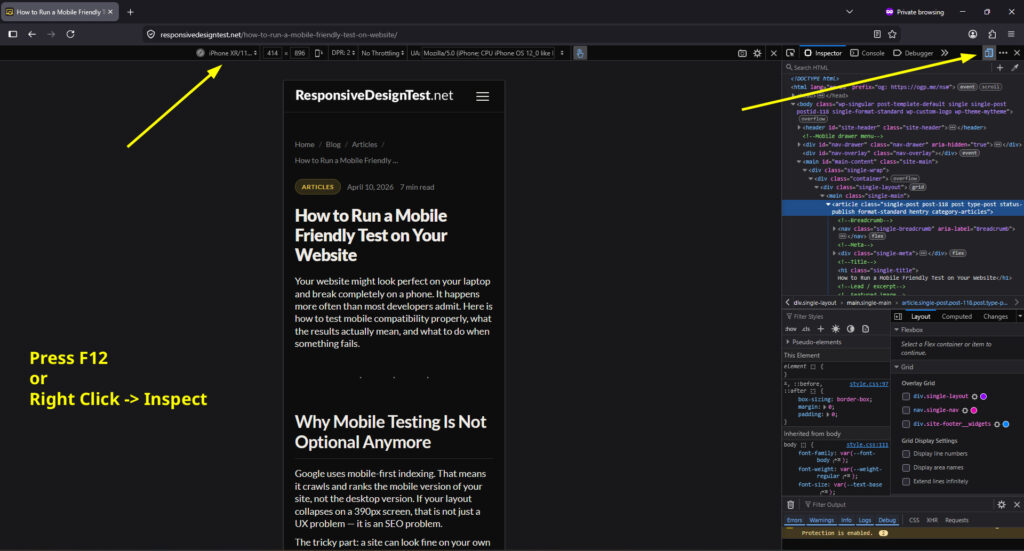
Browser DevTools: The Underrated Option
Chrome and Firefox both have a built-in device emulator. Open DevTools (F12), click the device toolbar icon, and you can test at any screen width. The advantage here is that you can interact with the page, inspect elements, and debug CSS in real time.
Set the width to 375px (iPhone SE), 390px (iPhone 14), and 360px (most Android phones). If your layout holds across those three, you are covering the majority of real-world traffic.
What a Mobile Friendly Test Actually Checks
Tools differ in what they measure. Broadly, issues fall into three categories:
Viewport configuration Without the correct meta tag, mobile browsers render your page at desktop width and then scale it down. The fix is straightforward:
<meta name="viewport" content="width=device-width, initial-scale=1">
If this tag is missing or misconfigured, everything else you do will fight against you.
Touch target sizing Buttons and links that are too small or too close together are flagged as usability failures. Google’s threshold is 48×48 CSS pixels with at least 8px of spacing. A navigation menu with links packed tight might pass a visual check but fail an accessibility audit.
Content wider than the screen This is the most common issue. It usually comes from one of these:
- Fixed-width elements (
width: 800pxon a container) - Images without
max-width: 100% - CSS Grid or Flexbox rows that do not wrap
- Third-party embeds (maps, videos, widgets) that use fixed dimensions
The symptom is horizontal scrolling. Users hate it. Search engines penalize it.
How to Test Mobile Website Online Without Installing Anything
Several free tools let you test mobile website compatibility directly in a browser:
- ResponsiveDesignTest.net — renders your site in real device browsers, not just emulated viewports. The free tier is limited but useful for spot checks.
- BrowserStack — renders your site in real device browsers, not just emulated viewports. The free tier is limited but useful for spot checks.
- Responsively App — open source desktop app that shows multiple viewports simultaneously. Good for development workflows.
- Screenfly / Responsivedesignchecker.io — simple viewport simulators, good for quick previews.
- Lighthouse — built into Chrome DevTools, runs a full mobile audit including performance, accessibility, and SEO signals.
A quick note on simulators vs. real devices: simulators can miss rendering bugs tied to specific OS versions or hardware. If your site serves a lot of traffic, testing on at least two physical devices (one iOS, one Android) is worth doing before a major launch.
The Mistakes That Actually Break Mobile Layouts
These are the issues that consistently appear in audits but do not always get flagged by automated tools.
Using px Where You Should Use rem or %
Fixed pixel values feel precise but resist scaling. A font set to 14px stays at 14px regardless of user preferences or zoom level. Use rem for font sizes and % or clamp() for widths. This is not just accessibility — it affects readability on high-density screens too.
Relying on Hover States for Core Functionality
Hover states do not exist on touchscreens. If you hide navigation, reveal prices, or show tooltips on hover, mobile users simply never see that content. Test every interactive element by tapping, not hovering.
Not Testing With Real Content
Developers often test layouts with short placeholder text. Real content is longer, messier, and breaks things. A navigation bar that works with four short labels might overflow when labels are translated to German or Portuguese. Test with actual text, especially in headings and buttons.
Forgetting the Keyboard
On mobile, form inputs trigger the virtual keyboard, which eats roughly half the screen. If your layout has a fixed footer or a sticky element, it may overlap the input field. This is almost impossible to catch without testing on a real device or a browser emulator that simulates the keyboard.
Once you know what is broken, the next step is actually fixing it — if you are not sure where to start, this guide on how to fix common mobile responsiveness issues walks through the most frequent problems and their solutions.
Reading Your Results: What to Fix First
Not all issues carry equal weight. Here is a practical priority order:
- Viewport meta tag — fix immediately if missing
- Content overflow / horizontal scroll — blocks usability entirely
- Touch target sizes — affects all interactive elements
- Font sizes below 12px — triggers legibility warnings in Google Search Console
- Render-blocking resources — affects load time on slower mobile connections
- Cumulative Layout Shift (CLS) — elements moving after load frustrate users and hurt rankings
For most sites, fixing the first three eliminates the majority of mobile usability errors reported in Search Console.
A Note on “Mobile Friendly” vs. “Mobile Optimized”
Passing a mobile friendly test means your site does not actively break on phones. It does not mean your site is good on phones.
A truly mobile-optimized site thinks about thumb reach zones (bottom of screen for primary actions), load performance on 4G rather than fiber, one-column layouts that do not just squish a desktop layout, and forms that request only what is necessary.
The test is the floor, not the ceiling.
FAQ
My site passes the mobile friendly test but Google Search Console still shows mobile usability errors. Why?
Search Console crawls your actual live URLs and can flag issues on specific pages that a single-URL test misses. It also uses slightly different criteria. Check which URLs are flagged in the report and test those specific pages rather than just your homepage.
Does a mobile friendly test check page speed?
Usually not directly. Tools like Google’s Mobile-Friendly Test focused on layout and usability, not performance. For speed, use PageSpeed Insights or Lighthouse specifically. Mobile performance and mobile-friendliness are separate signals, though both affect rankings.
How often should I re-test?
After any significant layout change, after adding new third-party scripts or embeds, and after theme or CMS updates. Also run tests if your Search Console impressions or click-through rate drops unexpectedly — layout regressions are a common hidden cause.
Can I test mobile friendliness for a site that is behind a login?
Automated tools cannot access password-protected pages. Use browser DevTools with device emulation for those sections, or a tool like BrowserStack that allows you to manually browse the site in a mobile environment.
Does a responsive design always pass a mobile friendly test?
Usually, but not always. A technically responsive layout can still fail if it uses touch targets that are too small, fonts below the minimum legibility threshold, or content that overflows on certain viewport sizes. Responsive is the approach; passing the test confirms the execution.
Test your site now
Ready to see how your site looks on mobile right now? Paste your URL into our responsive checker tool and get an instant preview across the most common screen sizes — no login, no setup required.