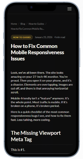
Look, we’ve all been there. The site looks amazing on your 27-inch 4K monitor. You’re proud. Then you open it on your phone, and it’s a disaster. Elements are overlapping, images are cut off, and there is that annoying horizontal scroll.
Mobile-friendly isn’t a “feature” anymore. It’s the whole point. Most traffic is mobile. If it’s broken on a phone, it’s broken period.
Here is a quick checklist of the most common responsiveness bugs I see, and how to fix them fast. Less talking, more coding.
The Missing Viewport Meta Tag
This is #1.
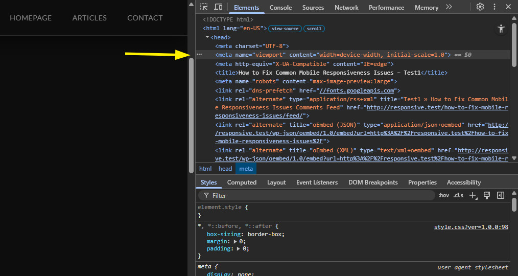
If you forget this, the mobile browser thinks, “Oh, this must be an old desktop site,” and it tries to zoom out to fit the whole 1200px layout onto a 375px screen. Everything becomes tiny and unreadable.
The Fix: You must tell the browser how to handle the scaling. Put this exact line inside your <head> block. Don’t ask questions, just do it.
<meta name="viewport" content="width=device-width, initial-scale=1.0">This tells the device: “Use your own width as the rendering width, and don’t zoom in or out by default.”
Horizontal Scrolling (The ‘Ghost’ Sidebar)
The worst. The user tries to scroll down, and the whole page starts wobbling left and right. This happens because some element is wider than the screen (viewport) and is pushing the boundary out.
How to find it:
Don’t guess. Use Chrome DevTools.
- Open the Inspector (
F12). - Switch to Device Mode (the phone icon).
- In the Elements panel, start deleting big chunks of HTML (
<section>,<div>) one by one. - When the scrollbar disappears, you just found the parent container of the offender. Undo (
Ctrl+Z) and refine your search inside that container.
The Fix (General Rules):
Stop using fixed width: 800px; on containers. Use max-width: 800px; width: 100%; instead.
Use box-sizing: border-box; everywhere. Seriously. Add this to your reset CSS right now:
*, *::before, *::after {
  box-sizing: border-box;
}
Why? Because by default, if you set width: 100% and then add padding: 20px, CSS adds them together (100% + 40px), breaking the layout. border-box forces the padding inside the 100%.
The nuclear option (if you are desperate): Add overflow-x: hidden; to your body or main container. It’s a hack, and it might hide intentional overflows, but it stops the scrolling. Use it wisely.
Images and Media Breaking Layouts
An image is natural-sized. If a user uploads a 4000px photo and you just put it in an <img> tag, it will occupy 4000px of width, pushing everything aside.
The Fix: Make all media responsive by default. This should be in every project’s base CSS:
img, video, canvas, svg {
  max-width: 100%;
  height: auto;
}
This ensures the image never gets wider than its parent container, and height: auto keeps the aspect ratio so faces don’t get squished. For background images, use background-size: cover;.
Hardcoded Widths vs. Flexible Layouts
This goes back to point #2. If you see width: 600px; on anything other than a tiny icon, you are probably doing it wrong for mobile.
The Fix: Embrace modern CSS layouts.
- Flexbox is your friend for rows (like navigation) that need to wrap on small screens (
flex-wrap: wrap;). - CSS Grid is perfect for main page layouts.
Use relative units. Instead of px, use %, vw (viewport width), or vh (viewport height).
If you need a value to scale smoothly between phone and desktop, use the clamp() function. It’s like magic:
/* Syntax: clamp(MIN, VAL, MAX) */
.container {
  width: clamp(300px, 80%, 1200px);
}
This means the container will try to be 80% wide, but never smaller than 300px and never larger than 1200px.
Touch Targets are Too Small
A mouse cursor is precise. A human thumb is not. If your buttons or links are tiny and packed together, users will misclick constantly. It’s frustrating.
The Fix: Give people space. The rule of thumb (pun intended) is that any clickable element should be at least 44×44 pixels.
You don’t need to make the text huge; just use padding:
.my-button {
  padding: 12px 24px; /* Increases the clickable area */
  display: inline-block; /* Essential if it’s an <a> tag */
}
Make sure links in a list have space between them too.
Test on Real Devices
The Chrome DevTools emulator is 95% accurate. But it’s not 100%.
You need to test on a real phone. If you have an iPhone, test it in Safari. Safari mobile has its own “unique” bugs (especially regarding 100vh height). If you don’t own the device, use a service like BrowserStack or just ask a friend to load the URL.
Keep it simple. Less fixed sizing, more fluidity. Good luck.
Test on Real Devices
The Chrome DevTools emulator is 95% accurate. But it’s not 100%.
You need to test on a real phone. If you have an iPhone, test it in Safari. Safari mobile has its own “unique” bugs (especially regarding 100vh height). If you don’t own the device, use a service like BrowserStack or just ask a friend to load the URL.
Alternatively, use a responsive design checker to quickly see how your layout holds up across multiple screen sizes without needing the actual hardware.
Keep it simple. Less fixed sizing, more fluidity. Good luck.